
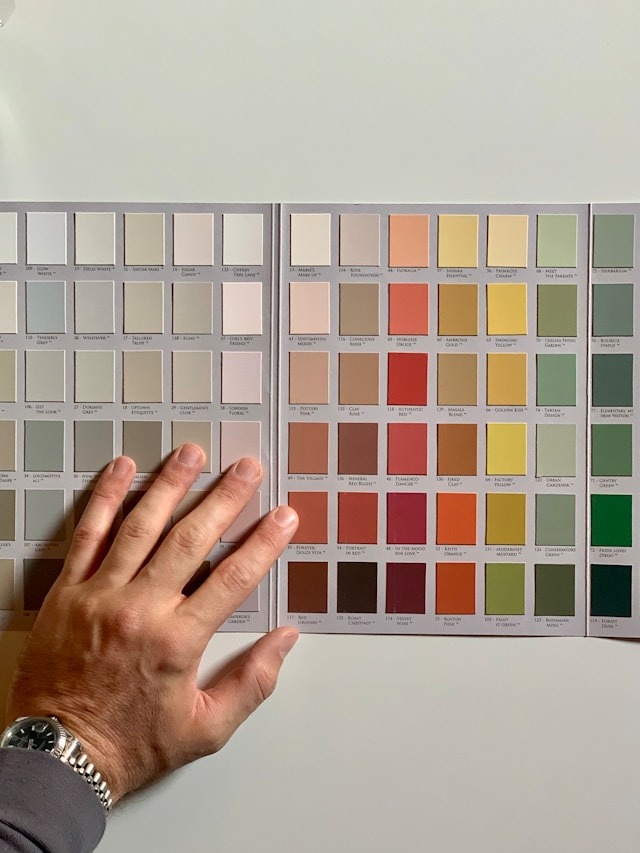
Transform your home with seasonal color palettes to mirror the outdoors. Winter calls for icy blues and shimmering silvers, creating a serene winter wonderland. In spring, awaken your space with pastel pinks, greens, and yellows for a fresh, cheerful vibe. Summer breezes in with cool tones of sky blue and seafoam green, punctuated by sunny yellows for a beachy feel. Autumn wraps your home in cozy warmth with rich reds, oranges, and browns. Each season’s palette, enriched with textured accents and balanced with lighting, creates a unique ambiance. A deeper exploration will reveal how to achieve these looks seamlessly.
Key Takeaways
- Seasonal color palettes transform home interiors, reflecting the changing landscapes and moods of winter, spring, summer, and autumn.
- Winter palettes favor icy blues, silvers, and whites, creating a serene, elegant space inspired by snowy landscapes.
- Spring introduces pastel pinks, greens, and yellows, refreshing interiors with colors that symbolize renewal and new beginnings.
- Summer colors include cool tones like sky blue and seafoam green, accented with sunny yellows, embodying a calming, beachy vibe.
- Autumn’s palette embraces rich reds, oranges, and browns, adding cozy warmth and creating a perfect ambiance for relaxation and gathering.
Winter Wonderland Palette
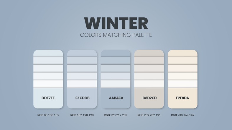
Embrace the serene beauty of a frost-kissed landscape with the Winter Wonderland palette, featuring icy blues, shimmering silvers, and pristine whites to transform your home into a tranquil haven. This palette, inspired by the quiet elegance of snow-covered scenes, infuses your space with a sense of calm and sophistication that is perfect for winter decor. Imagine your living room bathed in these cool tones, with soft, icy blue cushions contrasting against a silver-embellished white sofa. The result is a living space that feels both inviting and elegantly understated.
In the dining room, incorporate this palette through table settings and centerpieces that mimic the frosty outdoors. A tablecloth in shimmering silver, complemented by icy blue napkins and white porcelain, sets the stage for memorable winter gatherings. Though shades of yellow are typically associated with warmth and sunshine, forgoing them in favor of this cooler palette emphasizes the crisp, tranquil ambiance characteristic of winter months.
The addition of shimmering metallic accents throughout your home, from candle holders to wall art, adds a touch of elegance that captures the magical essence of a winter wonderland. This carefully curated color scheme guarantees your home remains a serene retreat, reflecting the beauty of the season outside your windows.
Spring Awakening Colors
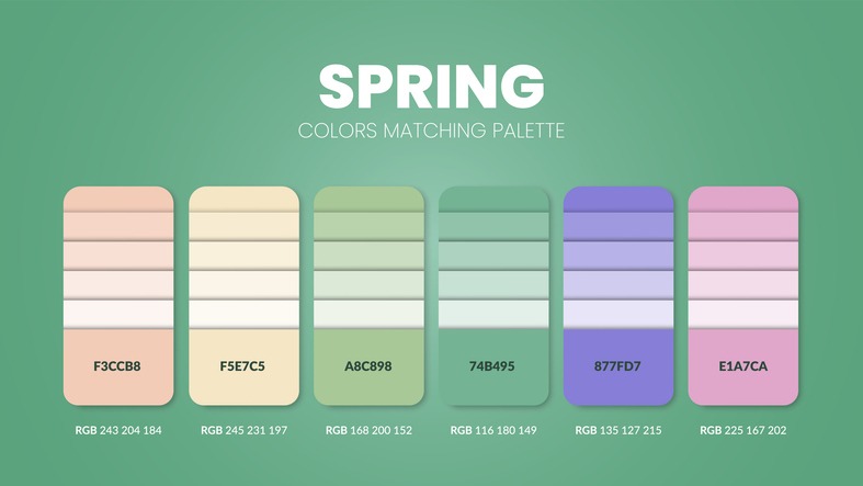
As winter’s chill melts away, let the vibrant hues of Spring Awakening Colors refresh and brighten your home with their lively essence. This color palette, brimming with pastel pinks, greens, and yellows, captures the essence of the season’s renewal and rejuvenation. You’re not just redecorating; you’re bringing the promise of spring indoors.
Incorporate soft, delicate shades that remind you of blooming flowers and new growth. These colors aren’t just pleasing to the eye; they evoke a sense of freshness and vitality that’s synonymous with spring. To truly embrace the season, mix in light and airy textures. These elements work together to enhance the springtime feel, adding a sense of brightness and openness to your space.
Don’t shy away from nature-inspired elements. Floral patterns and botanical prints are your allies in achieving the Spring Awakening look. They complement the color scheme beautifully, adding depth and interest. And if you can, bring in some fresh greenery. It’s not just an aesthetic choice; it’s a way to invite the spirit of renewal into your home.
Embracing the Spring Awakening Color palette means creating a cheerful, uplifting atmosphere. It’s perfect for welcoming the season of new beginnings.
Summer Breeze Hues
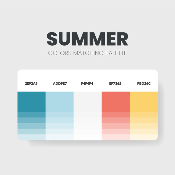
As you explore Summer Breeze Hues for your home, selecting cool tones lays the foundation for a calming and airy ambiance. Accent colors, like a splash of sunny yellow or soft pastel, truly pop against these tranquil backgrounds, adding layers of vibrancy and warmth. This approach not only captures the essence of summer but also creates a revitalizing and inviting space that feels like a gentle summer breeze.
Selecting Cool Tones
Often, selecting cool tones like sky blue, seafoam green, and soft lavender can transform your home into a tranquil oasis, perfect for unwinding during the summer’s heat. These summer breeze hues evoke calm and tranquility, making your space feel comfortably cool during the warmer months. They’re not only invigorating but also versatile, pairing beautifully with neutrals or other soft pastels for a cohesive look.
Here’s how these colors can breathe life into your home:
| Color | Description |
|---|---|
| Sky Blue | Mimics the clear summer sky, adding airiness. |
| Seafoam Green | Brings the calmness of the sea into your space. |
| Soft Lavender | Infuses a gentle, soothing vibe throughout. |
Incorporating these cool tones can create a sense of lightness, mirroring the breezy feel of a summer day.
Accent Colors Pop
Explore accent colors like sky blue, seafoam green, and sandy beige can instantly revamp your home into a summery sanctuary. These Summer Breeze Hues, with their invigorating and airy feel, evoke a sense of peace and relaxation, perfect for a summery atmosphere. By adding bursts of these hues through accessories like pillows, throws, and decor accents, you’ll instantly brighten up any room. The harmonious combination of light blues and greens with warm neutral tones creates a beachy vibe that’s both calming and energizing. Additionally, these paint colors work exceptionally well with natural light, enhancing the overall brightness and openness of a room. Immerse yourself in these color palettes for a transformation that embodies the essence of summer.
Autumn Glow Schemes
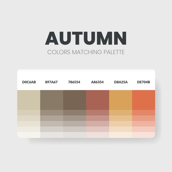
Embrace the cozy warmth of autumn indoors with Autumn Glow color schemes, featuring rich reds, oranges, and browns that mirror the season’s foliage. These palettes not only bring the beauty of fall inside but also create a warm ambiance that’s perfect for gathering and relaxation. By incorporating cozy textiles, seasonal decor, and elements that reflect the natural world, you can transform your space into an autumnal retreat.
To deepen the autumn feel in your home, consider these additions:
- Plush throws and pillows in rust, mustard, and burgundy to drape over sofas and chairs.
- Candle arrangements with scents like cinnamon and pumpkin to enhance the warm ambiance.
- Decorative pumpkins and gourds, both real and faux, to sprinkle throughout your living space.
- Copper accents, from photo frames to kitchenware, to catch the light and add an extra layer of warmth.
- Earthy textures in rugs and baskets to ground the space and tie together the autumn decor.
Textures and Tones Interaction
As you explore the interaction between textures and tones in your home, remember that the right mix can transform a room from flat to multidimensional. Integrating textures like velvet or faux fur with your color palette not only adds depth but also creates a cozy vibe. By balancing smooth and rough surfaces, you achieve a visually appealing space that’s both bold and harmonious.
Enhancing Depth With Texture
Textures like faux fur or velvet can instantly warm up your space, adding depth and richness to your color palette. By integrating a variety of textures, you’re not just designing a room; you’re crafting an environment that beckons with textural elegance, inviting depth through texture, and offering rich tactile experiences. Here’s how to achieve it:
- Combine smooth surfaces with rough textiles to balance visual contrast.
- Introduce plush pillows or throws for an instant touch of luxury.
- Use woven rugs to add both comfort and character underfoot.
- Incorporate natural elements like wood and stone for an organic feel.
- Experiment with metallic accents for a subtle shimmer that enhances depth.
Each element plays a pivotal role in creating a layered, inviting space that’s as visually appealing as it is comfortable.
Harmonizing Tones and Moods
Choosing the right blend of textures and tones can greatly elevate your home’s ambiance, making each room feel uniquely harmonious and inviting. Velvet and faux fur introduce warmth and depth, enhancing the mood of your space. By combining smooth and rough textures, you achieve a balance that captivates and maintains visual interest. This texture blending is essential for creating a tactile experience that invites touch and exploration. Tonal harmony emerges when these textures amplify the nuances of your color scheme, adding layers of depth. The interplay between textures and tones greatly impacts the room’s atmosphere, making mood enhancement an art form in itself. Through careful selection and pairing, you can craft a living space that resonates with visual appeal and a palpable sense of comfort.
Contrast: Bold Yet Balanced
Building on the harmonious foundation of tones and textures, let’s explore how contrasting elements can bring a bold yet balanced dynamic to your home’s interior. By carefully mixing bold patterns with neutral undertones, you create a space that’s visually intriguing yet soothing. The secret lies in achieving textural harmony that captivates without guaranteeing.
- Mix smooth fabrics with rough wood to add complexity and depth.
- Balance bold colors with subtle textures to keep the space inviting.
- Incorporate a variety of textures to elevate bold color choices.
- Use neutral undertones as a base for bold patterns to ensure cohesion.
- Achieve a dynamic look by mixing tones within your color palette.
Lighting to Enhance Colors
Understanding how different lighting types can greatly alter the appearance of colors in your room is pivotal. Warm lighting can make cozy color schemes feel even more inviting, enhancing the ambiance’s warmth and comfort. In contrast, natural light brings out the vibrancy in colors, making them pop and appear more true-to-tone. Achieving the right color temperature balance is essential; it’s all about finding the perfect match for your color palette to guarantee the ambiance versatility your space deserves.
Light layering plays a vital role in creating depth and dimension within your color scheme. By combining overhead lights with task and accent lighting, you’re not just lighting a room; you’re sculpting it. This technique allows for a dynamic interplay of light and shadow, which can dramatically highlight hues and textures, providing a showcase for the true tones of your chosen color palette.
Moreover, the use of dimmable lights offers unparalleled flexibility. You can adjust the lighting levels to complement the time of day or the mood you wish to create, ensuring your colors always look their best. Proper lighting is the key to not only enhancing hue vibrancy but also to ensuring that the true essence of your color choices shines through.
Seasonal Accessory Swaps
One can effortlessly transform their home’s ambiance to match the season’s spirit with strategic seasonal accessory swaps. This approach not only revitalizes your space but also keeps it feeling fresh and in tune with the time of year. By focusing on quick swaps, color coordination, and rejuvenating accents, you’ll find that updating your home’s look can be both easy and impactful.
Consider incorporating these items for a vibrant seasonal update:
- Pillows and Throws: Swap out your living room and bedroom textiles to reflect the current season’s colors and textures.
- Wreaths and Seasonal Decor: Introduce wreaths, pumpkins in autumn, or copper accents for a subtle nod to the season.
- Floral Arrangements: Fresh or faux, flowers are a perfect way to inject color and life into any room, easily tailored to the season.
- Accent Pieces: Small decorative items like candles, vases, or table runners can dramatically shift the mood of your space.
- Utilize Affiliate Links: Platforms like LiketoKnowIt provide convenient access to seasonal decor items, making your refresh even simpler.
Festive Touches for Holidays
Introducing festive touches like twinkling lights and garlands instantly elevates your home’s holiday charm. With a few simple additions, you can transform your space into a seasonal wonderland that radiates warmth and joy. Think about incorporating red and green throw pillows, cozy blankets, and metallic ornaments to infuse your living spaces with holiday spirit. These holiday home accents not only add visual interest but also complement seasonal color schemes beautifully.
| Festive Decor Ideas | How to Incorporate |
|---|---|
| Twinkling Lights & Garlands | Drape over mantles or around doorways for a magical glow. |
| Seasonal Accents | Scatter red, green, and metallic pillows and throws. |
| Holiday-Themed Centerpieces | Arrange candles, pine cones, and florals on tables. |
| Scented Candles | Place in living areas to create a warm, inviting ambiance. |
Don’t forget to display holiday-themed artwork, figurines, or decorative signs that add that extra touch of cheer. Each element works together to create a festive atmosphere that’s both inviting and reflective of the season’s joy. Remember, the key to successful festive decor is in the details—each carefully chosen piece contributes to the overall warmth and charm of your holiday home.
Nature-Inspired Color Choices
Drawing from the beauty of nature, nature-inspired color palettes bring the vibrant hues of flowers, fruits, and foliage right into your home. These palettes infuse your space with the natural elegance, organic harmony, and botanical bliss that only nature can provide. Imagine waking up to an interior that feels like a serene garden or a lush tropical paradise, every single day.
- Green shades inspired by Granny Smith apples, pea pods, and celery create a freshly harvested look that’s invigorating and vibrant.
- Tropical color schemes with bright oranges, deep blues, and hues reminiscent of shrimp and papaya transport you to an exotic escape.
- Citrusy palettes blend bold orange tones with sky-blue accents, offering a zest of energy and a revitalizing vibe.
- Vibrant color choices, including lively greens, sunny yellows, and rich purples, inject your home with an energetic and lively atmosphere.
- By integrating these nature-inspired hues, you’re not just decorating; you’re bringing a slice of the outside world into your living space, promoting a sense of well-being and tranquility.
Incorporating these colors into your home fosters a connection with the natural world, enveloping you in the comfort and beauty of the great outdoors.
Color Transition Tips
As you consider updating your home’s interior with the seasons, think about employing gradual palette shifts and seasonal accent elements. Swapping out small decor items or introducing seasonal flowers can subtly yet meaningfully transform your space’s vibe. This approach allows you to refresh your home’s look in a cost-effective and visually appealing way, without the need for extensive changes.
Gradual Palette Shifts
To create a smooth flow throughout your home, consider shifting color schemes gradually to maintain cohesion and harmony. This approach guarantees a seamless progression, enhancing the visual impact of your interiors with effortless elegance. Here’s how you can achieve this:
- Lean on subtle progressions between rooms for a cohesive design that feels naturally evolved.
- Utilize seamless color changes in accessories to refresh your space without overwhelming it.
- Embrace gradual palette adjustments in textiles, offering an easy update with each season.
- Incorporate elements like art or rugs that include both the current and the new color scheme to bridge the shift.
- Rely on natural light and how it interacts with your colors, as this can influence the perception of your color scheme adjustments.
Seasonal Accent Elements
You can easily change your home’s color scheme with the seasons by including strategic accent elements. Incorporating seasonal foliage, like pine branches or autumn leaves, brings a touch of nature’s palette indoors. Swapping out accessories such as throw pillows, curtains, and rugs transforms your space from summer’s vibrant hues to autumn’s earthy tones without major renovations. Seasonal floral arrangements can breathe new life into any room, creating an evolving backdrop that reflects the time of year. Festive tablescapes for holiday gatherings and cozy textiles for colder months add warmth and celebration. Utilizing decor items like wreaths, pumpkins, or holiday ornaments instantly updates the look and feel, while small touches like candles, vases, or artworks maintain a cohesive theme throughout the seasons.
Frequently Asked Questions
How Do I Find My Seasonal Palette?
To find your seasonal palette, take a Color Seasons quiz that considers your personal style, features, and color psychology. Match your traits to seasonal trends, choosing colors that reflect your personality and mood accurately.
How Do I Choose the Right Color Palette for My Interior?
To choose the right interior color palette, consider color psychology, trend influences, and your personal style. It’s about what speaks to you and complements your space, ensuring a balance between timeless appeal and personal flair.
How Do I Choose a Color Palette for My New Home?
To select a color palette for your new home, immerse yourself in color psychology, trend analysis, and your personal preferences. It’s about what connects with you, ensuring your space feels truly yours and stays stylish.
How Do You Use a Color Palette in Home Decor?
To use a color palette in home decor, consider color psychology to set the mood. Mix textures to add depth. Lighting effects can alter hues, enhancing the ambiance. It’ll make your space cohesive and inviting.
Conclusion
You’ve traveled through the seasons, transforming your home with palettes that breathe life into every corner. From the crisp Winter Wonderland to the vibrant hues of Summer Breeze, each season’s colors and textures blend seamlessly, offering a fresh vibe all year round. Remember, swapping accessories and adding festive touches are simple ways to keep your space in tune with nature’s rhythm. Embrace these color shift tips, and watch your home evolve with the seasons, effortlessly and beautifully.