
There is a shift towards creamy whites and earthy greens, making a bold statement on exteriors. Designers are highlighting warmth and sophistication with shades like Sherwin-Williams Creamy and Benjamin Moore’s Swiss Coffee. Nature-inspired greens, such as Sherwin-Williams Palm Leaf, are emerging as new neutrals, adding depth and complexity. Off-white and gray fusions cater to a versatile aesthetic, complementing modern architectural styles. Subtle blues and timeless classic whites are also making their mark, fostering calmness and a statement of elegance. A pop of bold color on the front door elevates curb appeal, making your home stand out. Dive deeper, and discover how these colors can transform your space.
Key Takeaways
- Creamy whites and warm off-whites are trending, offering warmth and sophistication to exteriors.
- Earthy greens, like Sherwin-Williams Palm Leaf, emerge as new neutrals, adding depth.
- A fusion of off-white and gray complements modern architecture with its versatile appeal.
- Subtle blues, such as Farrow & Ball’s Parma Gray, are popular for adding a calm, refreshing pop of color.
- Bold front door colors enhance curb appeal, adding a personal and welcoming touch to homes.
Creamy Whites Dominate
Why settle for stark whites when creamy whites, championed by designers like Catherine Bransetter, are making a bold statement in exterior paint trends? This year, it’s all about warmth and sophistication, and cream whites are at the forefront, offering a softer alternative that’s both modern and timeless.
A go-to for an English Tudor cottage is Sherwin-Williams Creamy, SW 7012. This choice isn’t just a whim—it’s a calculated decision to embrace a color that adds depth and character, steering clear of the clinical feel stark whites often bring. For a more versatile option, Benjamin Moore’s Swiss Coffee, OC-45. This isn’t your ordinary cream; Swiss Coffee brings a balanced tone to the table, dodging the overly yellow or stark white bullet with grace, making it perfect for siding, trim, and brick exteriors.
Swiss Coffee, in particular, shines as a trim color for white-washed brick homes, providing a subtle contrast that elevates the overall look. Its balanced tone ensures that it complements a wide range of architectural styles, from the classic charm of an English Tudor cottage to more contemporary designs.
The Rise of Greens
A significant number of homeowners are turning to earthy greens like Sherwin-Williams Palm Leaf, SW 7735, to refresh their exteriors with a natural and moody vibe. This olivey-brown tone adds a unique, grounded feel to any architectural design, striking a perfect balance between boldness and subtlety. It’s not just about aesthetics; it’s about bringing a slice of nature to your doorstep, blending your home seamlessly into its surroundings.
Sherwin-Williams Dried Thyme, SW 6186, is another green that’s making waves. It offers a lighter, yet equally bold option for those looking to step away from the conventional while avoiding the heaviness associated with darker hues. Greens, particularly these nature-inspired shades, are emerging as the new neutrals for exterior paint. They provide a depth and complexity that other colors can’t match, making your home stand out without overpowering the landscape.
It’s clear that these greens are not just a trend but a movement towards more nature-inspired living spaces. Whether it’s the moody allure of Palm Leaf or the vibrant energy of Dried Thyme, embracing green is about creating a connection between your home and the natural world.
Off-White and Gray Fusion
You’ll find that the off-white and gray fusion offers a versatile aesthetic appeal, perfectly complementing modern architecture. These hues, recommended by designers, bring a modern twist to traditional exteriors, making your home stand out. They strike the right balance between warmth and crispness, setting a contemporary tone that’s both inviting and stylish.
Versatile Aesthetic Appeal
As homeowners search for a modern yet timeless look for their exteriors, off-white and gray fusion colors like Farrow and Ball’s Drop Cloth, No. 283, emerge as top choices. These hues offer a modern twist, blending white and gray to create versatile options that suit various architectural styles. Designers Marguerite Johnson and Anna Still highlight off-white as a fresh alternative for historic homes, moving beyond traditional white to embrace a more nuanced, subtle aesthetic appeal. The fusion of white and gray in colors like Skimming Stone, No. 241, achieves a balance, providing warmth with a crisp edge. This blend proves ideal for those seeking a subtle yet impactful update, making these fusion colors a preferred choice for exterior updates.
Complementing Modern Architecture
Off-white and gray fusion colors revolutionize modern architectural exteriors, offering a contemporary twist that balances warmth with cutting-edge design. Farrow & Ball’s Drop Cloth and Skimming Stone are leading the charge, providing a fresh alternative to traditional white. These hues aren’t just versatile; they’re a designer’s dream, effortlessly complementing a range of architectural styles from sleek modern homes to historic residences. By melding white and gray tones, these fusion colors achieve a sophisticated and timeless look, elevating modern architecture to new heights. Whether you’re updating a classic home or building anew, off-white and gray fusion colors promise to enrich your exterior with a refined, contemporary edge that’s both stylish and enduring.
The Blue Accent Trend
As you explore the blue accent trend for your home’s exterior, selecting the right shade is essential. Subtle blues like Farrow & Ball’s Parma Gray No. 27 can add a fresh pop of color without overwhelming your space. Additionally, incorporating these hues can positively impact your home’s aesthetic appeal, offering a serene and inviting atmosphere.
Choosing the Right Shade
When selecting the appropriate hue, consider the growing popularity of toned-down blue shades like Farrow & Ball Parma Gray No. 27 for a subtle yet impactful exterior accent. Incorporating color through trim or shutters in these tones aligns with current trends, providing a new, stylish touch. Designers suggest these shades for enhancing your home’s curb appeal without overpowering its overall color scheme.
| Color Name | Use Case | Impact on Home Exterior |
|---|---|---|
| Parma Gray No. 27 | Trim & Shutters | Subtle, Stylish Accent |
| Mizzle No. 266 | Doors & Windows | Soft, Inviting Atmosphere |
| Sky Blue | Accent Walls | Invigorating, Modern Look |
| Sea Green | Fencing & Railings | Serene, Harmonious Feel |
Choose muted blues and greens to effortlessly infuse character into your home’s design. These colors are not just trends but refined choices that endure the test of time.
Blue Accents Psychological Impact
Integrating blue accents into your home’s exterior not only boosts its aesthetic appeal but also fosters a sense of calm and serenity. The psychological impact of these hues cannot be overstated, as they bring tranquility to exterior spaces.
Here’s how blue accents work their magic:
- Evoke Feelings of Calmness: Muted blue tones, like Farrow & Ball’s Parma Gray No. 27, instill a sense of peace and calm.
- Add Personality with Subtlety: A subtle pop of color through blue accents adds visual interest without overwhelming.
- Sophistication and Charm: Incorporating blue through trim or shutters offers a sophisticated touch that elevates the home’s overall charm.
Timeless Classic Whites
Timeless classic whites, like Sherwin-Williams Snowbound SW 7004 and Pure White SW 7005, offer your home an enduring appeal that never fades. When you’re considering painting your exterior, classic white is a versatile choice that complements a wide range of architectural styles. Benjamin Moore’s White Dove OC-17 epitomizes this versatility, striking the perfect balance between warmth and crispness. This shade has become a popular choice for homeowners seeking a clean, classic aesthetic. Especially in Southern regions, white exteriors are a staple that never goes out of style, providing a timeless appeal that enhances any home’s appearance.
| Shade | Description |
|---|---|
| Sherwin-Williams Snowbound SW 7004 | A soft, warm white that creates a welcoming atmosphere. |
| Sherwin-Williams Pure White SW 7005 | A true, crisp white that offers a clean canvas. |
| Benjamin Moore White Dove OC-17 | Balances warmth and crispness, perfect for various architectural styles. |
| Classic White | Timeless appeal, never goes out of style. |
| Versatile Choice | Complements a wide range of architectural designs. |
Incorporating classic white into your home’s exterior isn’t just a safe bet; it’s a statement of elegance that remains in vogue year after year.
Bold Front Door Choices
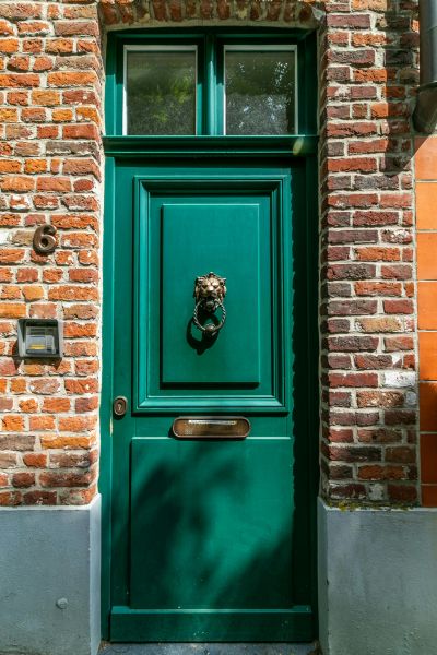
Choosing a bold front door color, like Sherwin-Williams Poinsettia Red SW-6594, instantly elevates your home’s curb appeal and expresses your unique style. It’s not just about a splash of color; it’s about making a statement that reflects your personality and distinguishes your home from the rest. A vibrant door like Poinsettia Red sends a message of warmth and welcome, transforming the entrance into a focal point that catches the eye and invites guests inside.
Here’s how a bold front door can impact your home:
- Boosts Curb Appeal: A bold front door color adds a cheerful, welcoming touch, making your home stand out in the neighborhood.
- Complements Exterior Palette: A punch of color, such as Poinsettia Red, can harmonize with your home’s exterior palette, enhancing its overall appeal.
- Expresses Personality: Your front door color is a reflection of your style and personality, making your home uniquely yours.
Incorporating a bold color like Sherwin-Williams Poinsettia Red SW-6594 as your front door choice not only adds a welcoming punch of color but also complements your exterior palette, enhancing the overall impact of your home’s appearance.
Emphasizing Neutrals and Darks
Shifting away from brighter hues, embracing neutrals like Swiss Coffee and Creamy White alongside dark shades such as Cheating Heart and Cyberspace can dramatically enhance your home’s exterior with a blend of sophistication and timeless elegance. These neutrals and darks offer a balance that’s both visually striking and versatile, fitting various architectural styles with ease.
Warm neutrals such as Amazing Gray and Fawn Brindle introduce a cozy, inviting atmosphere that complements the bold drama of dark shades. This combination isn’t just about aesthetics; it’s about creating a harmonious environment that welcomes you home. The versatility of this palette means it’s adaptable, whether your home boasts a modern minimalistic look or a classic, traditional vibe.
Incorporating dark accents with these neutrals takes your home’s exterior to the next level, making it stand out in a subtle, yet impactful way. This isn’t just a trend; it’s a strategic choice for those looking to imbue their space with a sense of balance and sophistication. The result? An exterior that’s as amazing as it is timeless, proving that a well-thought-out palette can truly transform your home’s curb appeal.
Frequently Asked Questions
What Is the Popular Exterior House Color?
You’re considering the top exterior house color, right? Immerse yourself in eco-friendly coatings with bold contrasts. Embrace dark elegance, natural hues, and earth tones. Pastel’s making a comeback, alongside bright accents and matte finishes.
What Are the Current Color Trends?
You’ll see Earthy Greens, Bold Blues, and Warm Neutrals leading the way. Matte finishes, Sunset Oranges, and Pastel Palettes add depth, while Natural Whites, Vibrant Yellows, Deep Purples, and Rustic Reds enliven spaces.
Is Gray Out?
No, gray’s not out. It’s evolving with gray alternatives, influenced by color psychology, regional preferences, and sustainability trends. Paint technology enhances its versatility, blending historic inspirations with modern contrast combinations and natural light effects.
Conclusion
As you explore exterior paint trends, you’ll notice a clear trend towards nature and simplicity. Creamy whites and soft greens are dominating, offering a fresh, serene look. The fusion of off-white and gray, alongside strategic blue accents, adds depth and character. Classic whites remain unbeatable for a timeless feel. Don’t shy away from bold front doors to inject personality. Embracing neutrals and darks will guarantee your home stands out with sophistication and style. Immerse yourself, and make your mark.